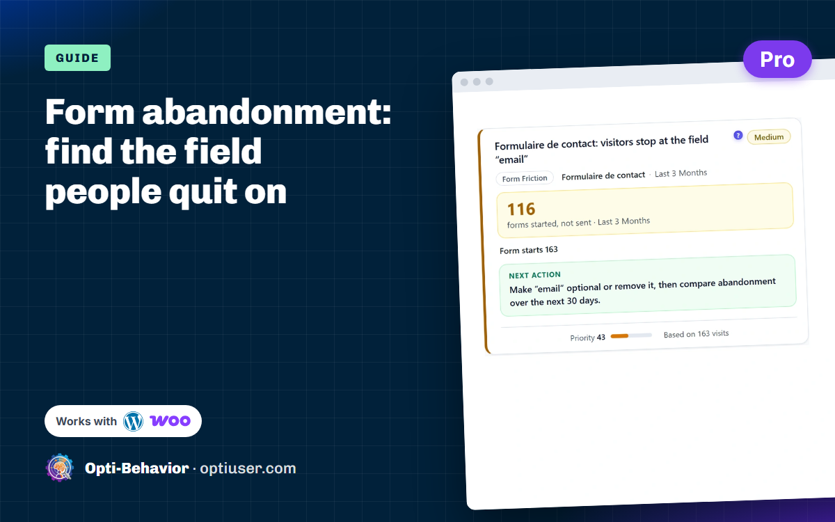

Form abandonment rate = (people who started the form − people who sent it) ÷ people who started it. If 200 visitors type in your form and 60 send it, 70% abandoned. Your first action: find the last field people touch before they leave, and change only that field.
That field is almost always the answer. People do not quit forms at random: they stop on one box, for one reason. Below is how to measure it, how to track it in WordPress (with Google Analytics 4 or with a plugin), what we found on our own form this month, and 10 fixes that usually help.
Contents
- How to calculate the form abandonment rate
- Why people abandon forms
- How to track form abandonment in WordPress
- How to find the exact field people quit on
- Our own form: visitors stop at the URL field
- 10 fixes for form abandonment
- Checkout forms: a special case
- Measure, change one thing, measure again
- Form abandonment FAQ
How to calculate the form abandonment rate
Form abandonment rate = (form starts − form submissions) ÷ form starts.
Example: 200 people typed in your form, 60 sent it. (200 − 60) ÷ 200 = 70% abandonment.
Note the word started. People who only looked at the form and never touched it are a different problem: the form looks too long, or the offer above it is not convincing. Keep the two apart, because the fixes are different.
| Number | What it tells you |
|---|---|
| Views | How many people saw the form |
| Starts | How many began typing |
| Submissions | How many sent it |
| Start rate (starts / views) | Does the form look easy enough to begin? |
| Abandonment rate | Do people finish once they start? |
| Last field touched | Where exactly they give up |
With small numbers, be careful. On 30 visits, two or three people change the rate by ten points. Read the trend over several weeks, and look at what people actually did before you trust a percentage.
Why people abandon forms
- Too many fields. Each extra box is one more reason to stop.
- Personal questions too early. A phone number or a budget on step one feels pushy.
- Unclear labels. "Reference" or "Company ID"? People do not know what to type.
- The visitor does not have the answer at hand. An order number, a VAT number, a page address: people leave to find it and do not come back.
- Strict formats. The phone field rejects spaces, the date field wants a special format.
- Hidden error messages. The error shows at the top, the visitor is at the bottom.
- Bad mobile layout. Tiny fields, the keyboard covers the button.
- No trust. No word about what happens to their data or when they will hear back.
- Surprise costs (on checkout forms). Shipping or fees appear at the last step.
- Forced account creation. "Create a password" makes many people leave.
- Slow or broken submit. The button spins forever, or a script error stops it. If the form says "thank you" but no e-mail arrives, that is not abandonment but a delivery problem: see our guide on a WordPress contact form not sending email.
How to track form abandonment in WordPress
You have two honest options: Google Analytics 4 gives you the overall rate, a form analytics plugin gives you the field.
Option 1: Google Analytics 4 (form_start and form_submit)
GA4 has "Form interactions" in its enhanced measurement settings (Admin > Data streams > your stream > Enhanced measurement). When it is on, GA4 sends a form_start event the first time a visitor interacts with a form in a session, and a form_submit event when a form is submitted.
- Turn on "Form interactions" in enhanced measurement.
- Register
form_idas a custom dimension, so you can tell your forms apart. - In Explore, build a free-form table: rows = form_id, values = event count of form_start and form_submit.
- Abandonment rate = (form_start − form_submit) ÷ form_start, per form.
What GA4 will not tell you: which field people stop on. And check the figures against the entries you really receive: on forms that send by JavaScript (many WordPress form plugins do), the submit event can be missed or counted when validation fails. Test your form once and compare.
Option 2: Opti-Behavior Form Analytics (Pro)
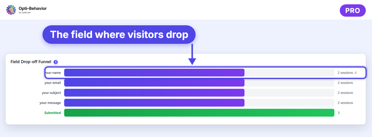
Opti-Behavior Pro detects the forms on your WordPress pages and measures each field: views, starts, submissions, time per field, errors and the last field touched before leaving. It works with Contact Form 7, WPForms, Gravity Forms, Ninja Forms, Formidable Forms, Forminator and standard HTML forms, with no event to set up. The data is stored in your own WordPress database. See the Form Analytics page for what each screen shows.
How to find the exact field people quit on
You can guess, or you can measure. Field-level data gives you four signals per field: time spent, how often people re-type, errors, and how often it is the last field touched before leaving. The field with a long time, many corrections and many exits is your first suspect.
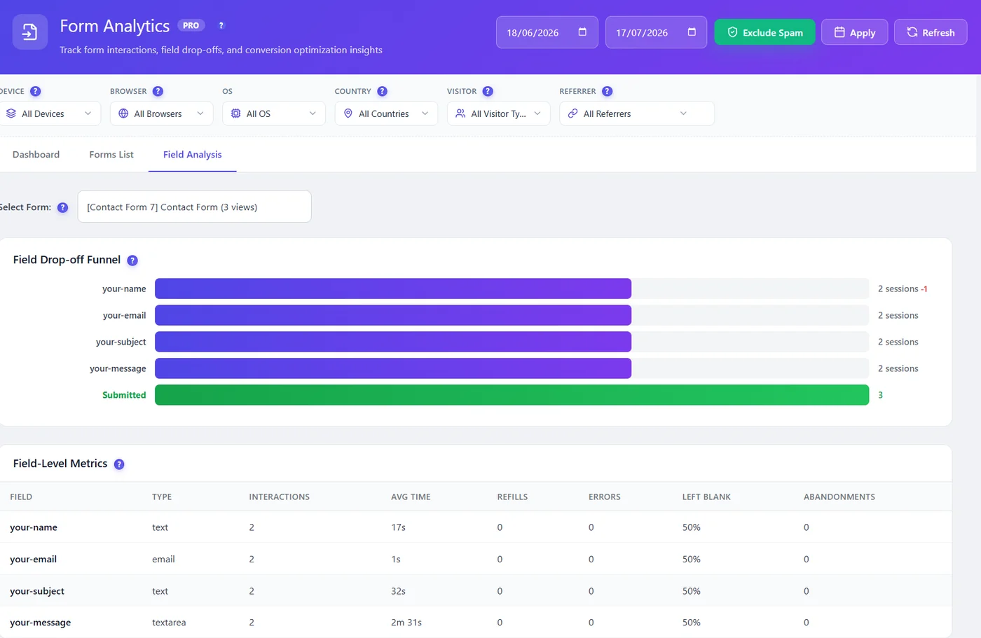
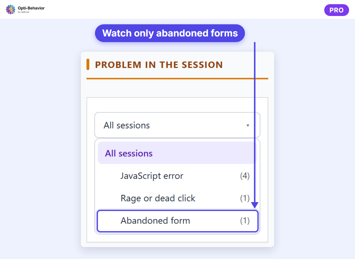
Then watch what happened. With Pro session recordings, open 5 to 10 visits of people who left at that field: you see whether they hesitated, scrolled up to re-read, hit an error or switched tabs. In Pro, Smart Insights also turns a form whose abandonment rate goes above 60% into a card, so the form to fix first comes to you without opening every report.
Our own form: visitors stop at the URL field
We run Opti-Behavior on optiuser.com, so here is our own case, with the figures read in the plugin on 31 October 2026 (period 2 to 31 October 2026, spam traffic excluded).
The form is our free heatmap tool: one field, "Your page address", and one button, "Show heatmap". It is about as short as a form can be. Yet the plugin shows that visitors stop at the URL field:
- 30 visits on the form over the period;
- 26 interactions with the URL field;
- the field where people stop: the URL field, the only one.
The plugin’s own verdict was "weak signal, look at the recordings first". It is right: 30 visits is too few to trust a percentage, and a one-field form cannot be made shorter. So we did not jump to a redesign.
What we think is happening
A short form can still ask for something the visitor does not have at hand. Many people reach the tool from a blog post, on a phone, without the address of the page they want to test in their clipboard. Typing a full page address on a phone keyboard is slow. The field asks for effort before the visitor has seen any result.
What we change
- Watch the recordings of the visits that touched the field without sending it, to confirm or reject the idea above.
- If confirmed, make typing optional: add a "Try it with an example page" button next to the field, so a visitor can see a heatmap first and test their own page afterwards. The field itself stays (it is the whole point of the tool), and the hint "No need to type https://" stays.
What we will measure in 30 days
The same figures, on the same length of period, after the change: visits on the form, interactions with the URL field, and how many visits reach a heatmap. We will add the result here. We have no result yet, and we will not guess one.
The lesson for your own forms: a short form is not automatically an easy form. Ask yourself, field by field, "does the visitor have this answer in front of them right now?"
10 fixes for form abandonment
| Fix | Why it works |
|---|---|
| Remove every field you do not use | Fewer fields, fewer reasons to stop |
| Make the phone number optional, or remove it | It is one of the most quit fields |
| Put easy fields first (name, email) | Small wins build momentum |
| Write clear labels, add an example below | People stop guessing |
| Offer a way around information people may not have (example, "I don’t know", optional) | Nobody leaves to look for an answer |
| Accept many formats (spaces, dashes, dates, addresses without https://) | No more error loops |
| Show errors next to the field, in red, right away | People see and fix them |
| Make fields and buttons big on mobile | Easier to tap and type |
| Add one line of trust near the button | "We reply within 24 hours. No spam." |
| Split long forms into short steps with a progress bar; show all costs early on checkout | Big forms feel smaller, no nasty surprise at the end |
Do not apply all ten at once. Pick the one that matches the field your data points to.
Checkout forms: a special case
On WooCommerce, checkout abandonment is often the biggest money leak on the site. Watch for coupon fields that pull people away to search for codes, forced account creation, and payment errors. To see which purchase step loses the most buyers, read our guide to WooCommerce conversion tracking. Our guide on WooCommerce checkout abandonment goes deeper.
Measure, change one thing, measure again
- Let form tracking run for one to two weeks (longer on a small site: we wait 30 days on ours).
- Pick the field with the biggest drop, in number of people, not in percent.
- Watch 5 to 10 recordings of people who left there.
- Change that one field. Write the date of the change.
- Compare the abandonment rate over a period of the same length, or run an A/B test for a clean answer.
Want to know more about the tool side? Read WordPress form analytics. To turn what you find into a list of fixes for a client or a team, use our analytics report template.
Find the field that makes people quit
Opti-Behavior Pro shows form abandonment field by field on WordPress. Start free, and try Pro free for 6 months.
Form abandonment FAQ
What is form abandonment?
Form abandonment is when a visitor starts filling a form but leaves before sending it.
What is a good form abandonment rate?
It depends on the form. Short contact forms can stay well under 50%, while long quote or checkout forms are often higher. Compare your form with itself over time rather than with an average.
How do I track form abandonment in WordPress?
For the overall rate, turn on "Form interactions" in GA4 and compare form_start with form_submit per form. For the field people stop on, use a form analytics tool: Opti-Behavior Pro tracks views, starts, submissions and drop-off per field for the main WordPress form plugins and standard HTML forms.
Which field causes the most form abandonment?
Phone number fields, long message boxes early in the form, password creation and any field asking for information the visitor does not have at hand. Your own data will show your worst field.
Can a one-field form have abandonment?
Yes. Our own heatmap tool has one field and visitors still stop there. Length is only one cause; effort and missing information are others.
The Opti-Behavior Team