
Table of Contents
Requires Opti-Behavior Pro. User Journey Analytics is a Pro module. View pricing or start the 6-month free trial.
User Journey Analytics visualises how visitors move through your site, step by step, as a Sankey flow diagram. This overview explains the diagram and the four tabs.
Requirements #
- Plan: Opti-Behavior Pro
- WordPress: 5.9+
Opening User Journeys #
Go to WP Admin → Opti-Behavior → User Journeys. The page has four tabs: Journey (Sankey), Top Paths, Entry & Exit, and Page Groups.
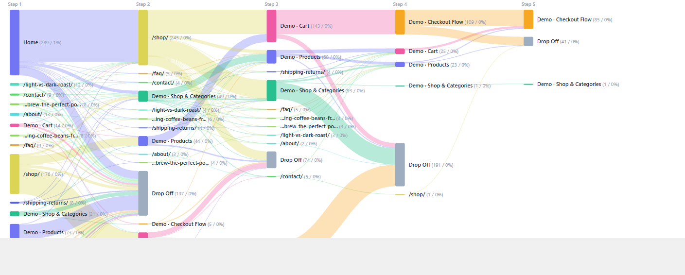
Reading the Sankey diagram #
- Each column is a step in the journey (step 1, step 2, and so on).
- Each node is a page (or page group) at that step.
- The bands between nodes are visitor flows; a thicker band means more visitors took that path.
- Hover a band to see the exact count and share.
Expected result #
You can see the dominant paths through your site and where visitors branch off or drop out.
FAQ #
Why are some pages combined? #
Page Groups can combine similar URLs (e.g., all products) to keep the diagram readable. See Page Groups.