
A click heatmap shows every click visitors made on a page. The colour of a spot is the density of clicks: blue for a few clicks, then green, yellow and red where clicks pile up. Colours are relative to the page, so the hottest spot is always red, even on a page with little traffic.
How to read the colours #
| Colour | Meaning | What to do |
|---|---|---|
| Red / orange | The most clicked areas of the page | Check they are the elements you want clicked (your goal button, key links). |
| Yellow / green | Regular clicks | Secondary actions. Fine if they help visitors move forward. |
| Blue / no colour | Few or no clicks | Normal for text. Worrying if your main button sits there. |
Numbers matter more than colours on a small sample. With Opti-Behavior Pro, hover a spot to see its click count (the Count Bar Display setting), and read the exact ranking in Top Clicked Elements.
Five patterns and what they tell you #
| Pattern | Likely cause | Fix |
|---|---|---|
| Clicks on images, icons or titles that are not links | Visitors expect more detail | Link them to the product, the article or a larger image. |
| Many clicks on the menu, few on the page | The page does not answer their question | Add the missing information above the fold; check which menu items are clicked. |
| Main button with no click | Not seen, not clear or not convincing | Check the scroll heatmap, rename the button (say what happens), add proof next to it. |
| Repeated clicks on one element | Rage clicks: slow or broken element | Watch a recording of the page; check Errors & Performance (Pro). |
| Clicks spread everywhere | No clear next step | Keep one main action and make it visually dominant. |
Tools that make the reading accurate #
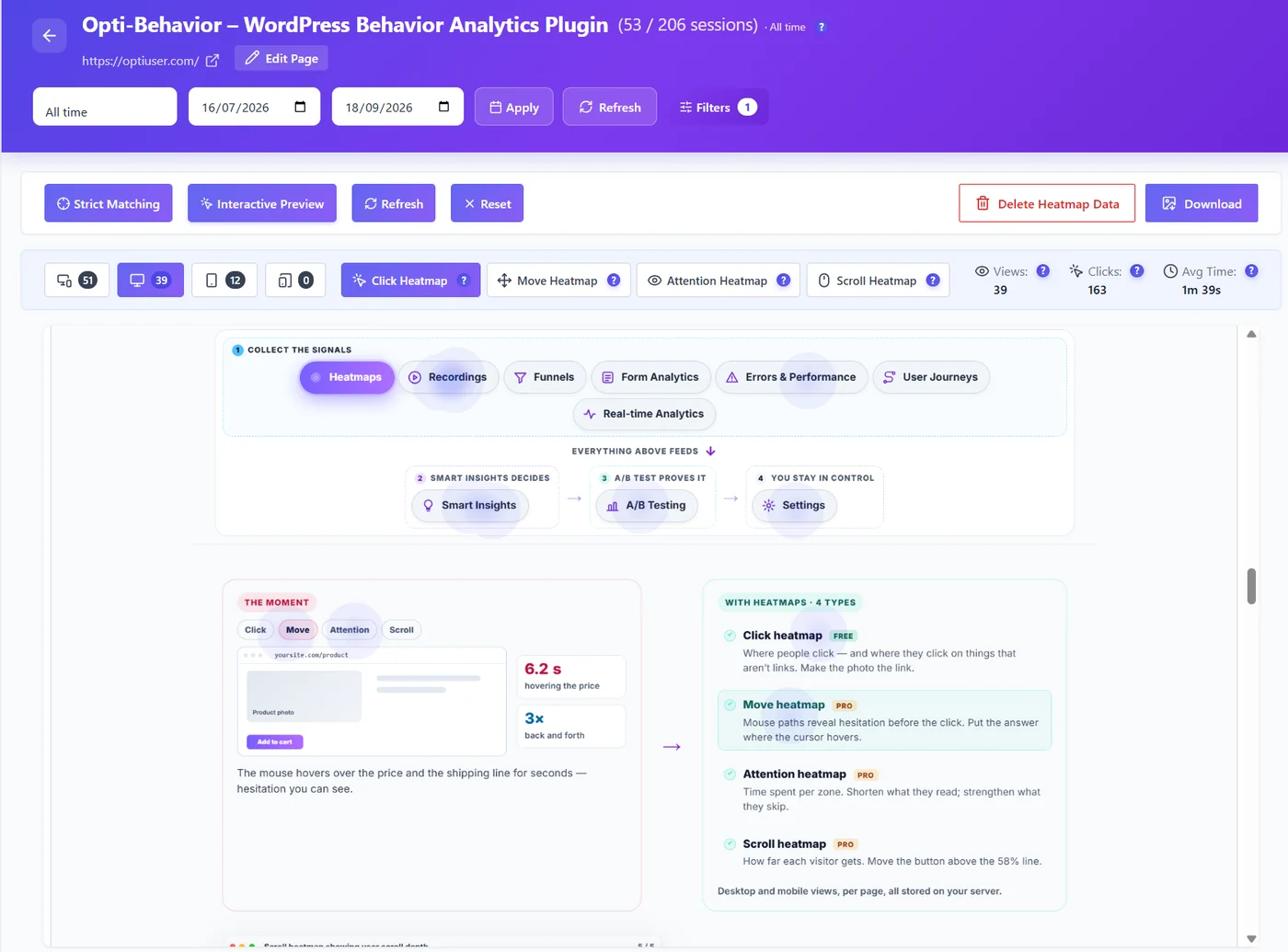
- Strict Matching (on by default) shows only clicks on elements that still exist on the page. Turn it off after a redesign to also see clicks recorded on the old layout.
- Interactive Preview lets you open menus, accordions, tabs and popups in the preview, so clicks recorded inside them appear in the right place.
- Device buttons: always read desktop and mobile separately – layouts differ.
- Filters: compare new and returning visitors, or visitors from Google versus a campaign.
Expected result #
You can name the three most clicked elements of the page, say whether the main button is among them, and list one change to test.
FAQ #
Why is a spot red when only a few people clicked? #
Colours are relative: the most clicked area of the page is always the hottest. Check the number of views at the top of the page before drawing conclusions.
Why do some spots float over empty space? #
The page changed since the clicks were recorded, or the element was hidden (menu, popup). Keep Strict Matching on, or open the element with Interactive Preview.
Are clicks on the cookie banner counted? #
They appear on the heatmap if the banner was on the page, but since 1.9.2 a click on a consent banner is not counted as an engagement click in your statistics.


