
The same page is a different page on a phone: columns stack, the menu hides behind a burger icon and your main button can move three screens down. That is why Opti-Behavior records and shows heatmaps per device.
Switching views #
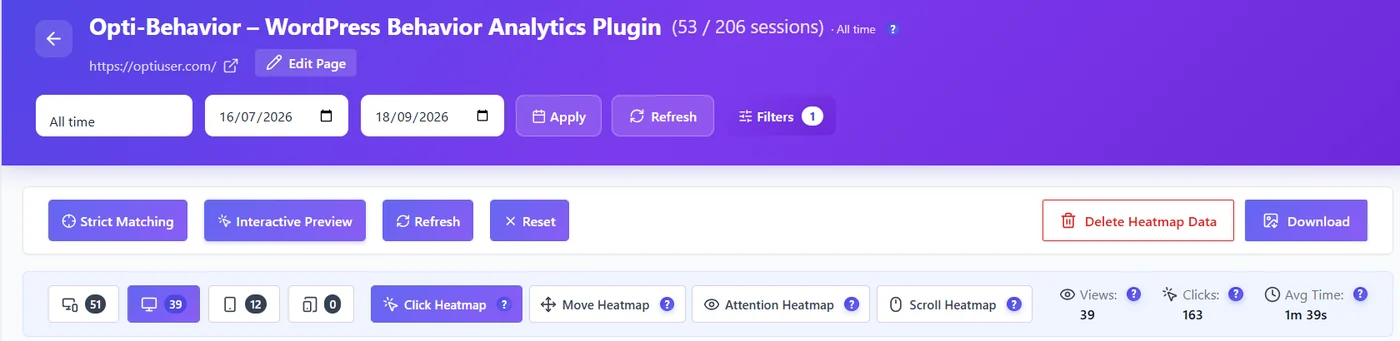
- From the Heatmaps list, click Desktop (n) or Mobile (n) on a page row.
- On the heatmap page, use the device buttons: all devices, desktop, tablet, mobile. Each shows its number of sessions (above 9,999 it reads “12 k”; hover for the exact number).
- The preview is drawn at the real width of the chosen device, so the heatmap lines up with the layout your visitors saw.
The all devices view places each click on the element it hit and redraws it on the current layout, so it stays readable even though visitors used different screens.
How screen sizes are grouped #
Settings → Heatmap Settings → Tracking Accuracy decides which screen widths are recorded:
| Option | Desktop widths | Mobile widths | When to use |
|---|---|---|---|
| High Accuracy (default) | 700–1920 px | 320–600 px | Most sites: only typical screens, the cleanest heatmaps. |
| Standard | 600–2560 px | 280–768 px | Wide monitors or many tablet visitors. |
What to compare #
- Share of visits – the Device split column of the Heatmaps list tells you which view matters most.
- Main button – is it above the fold on mobile? Check the Scroll heatmap (Pro) on the mobile view.
- Menu clicks – on mobile, many clicks on the burger icon often mean visitors did not find what they wanted on the page.
- Tap targets – clusters around small links on mobile point to buttons that are too small or too close.
Expected result #
Switching device reloads the heatmap for that screen size, with its own session count, at the right width.
FAQ #
Why does the mobile heatmap have so few sessions? #
Your audience may be mostly desktop, or mobile visits fall outside the recorded widths. Try Standard accuracy.
Are tablets included in mobile? #
Tablets have their own button. With Standard accuracy, small tablets up to 768 px are grouped with mobile heatmap data.
Can I see a specific phone model? #
No. Heatmaps are grouped by device type; use recordings (Pro) to watch a single visit.


